Miles: A smartwatch for everyday stress regulation.
An academic project with Miles designing a smartwatch interface that helps people notice and manage stress before it builds. User interviews, a literature review, and two rounds of user testing.
Participant names have been changed. The participant referred to as "Amy" is a pseudonym.The Problem
People with high stress often notice it too late to act, and existing tools assume fixed routines that don't fit fluctuating daily capacity.
What I Did
Led research across three interviews and a literature review, then designed and tested a stress-management watch through lo-fi and hi-fi prototypes.
Outcome
A validated concept built around early stress visibility, low-effort emergency support, and self-awarenes.
Stress is easiest to manage before you feel it — but that's exactly when it's invisible.
Stichting Miles HealthTech supports people living with stress-related and mental-health challenges. The brief was open: design a watch interface that helps people manage and cope with stress. My research question narrowed it to something I could actually investigate — how are long-term and short-term stress symptoms related, and where can a design intervene?
The recurring theme across every interview was lateness: people recognise stress only once it has already escalated. One participant, living with a functional neurological disorder, put it in an image I kept coming back to.
That framed the design goal: make rising stress visible early and give people low-effort ways to act on it, rather than another tool that only helps once you're already overwhelmed.
Three perspectives on the same problem.
The Expert
A psychology student walked me through the physiology of stress — why short-term stress can be beneficial, how it becomes chronic, and concrete behavioural tools: breathing techniques, the physiological sigh, and bodily check-ins (jaw tension, posture, breathing) as early signals of stress.
The Lived Experience
A peer with generalised anxiety described stress from the inside: the value of acceptance over suppression, how overthinking turns short-term stress chronic, and why rigid scheduling tools fail people whose capacity changes day to day.
The Edge Case
Amy, living with FND, showed the extreme end: stress can cause her body to shut down, and during an episode she cannot move and does not speak. Her needs reshaped how I thought about emergencies and bystander communication.
Two insights from synthesis did the most work downstream: acceptance and self-awareness are the entry point to managing stress (not suppression), and stress triggers are highly individual — so the design had to support personal patterns, not prescribe one routine.
Where the thinking happened.
A watch face is small and stress is sensitive. Most of the design work was about reducing effort and protecting the user at the moments that matter. Three decisions stand out.
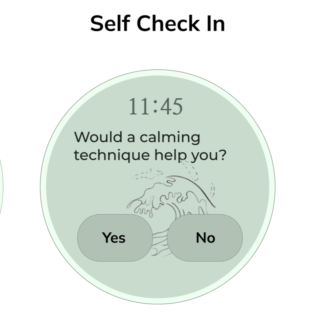
A swipe — not a tap — to reveal your stress level.
The home screen hides the stress reading behind a swipeable control rather than showing it outright or behind a button. Two reasons: a swipe prevents accidental opens, and stress data is personal — a glance over your shoulder shouldn't expose it. The label itself ("Show my stress level") is editable, so users can disguise it however they like.
Why it matters: the interaction carries the privacy requirement, instead of bolting privacy on as a setting.
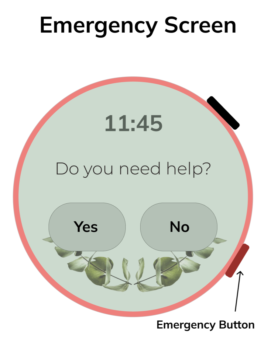
An emergency flow that assumes the user may not be able to explain themselves.
Pressing both physical buttons triggers the emergency path. It opens with a single "Do you need help? Yes / No" — a deliberate confirmation step so an accidental press isn't mistaken for a crisis, while reassuring a real user that help is coming. From there: message, call, or emergency services, routed to pre-set contacts.
Amy's input shaped the edges of this: she can't be touched during an episode and won't respond to shouting, so the design leans on a pre-set contact card and physical-button access rather than anything requiring speech or fine navigation in the moment.
Why it matters: the safety-critical path is built around the user's worst moment, not their calmest one.
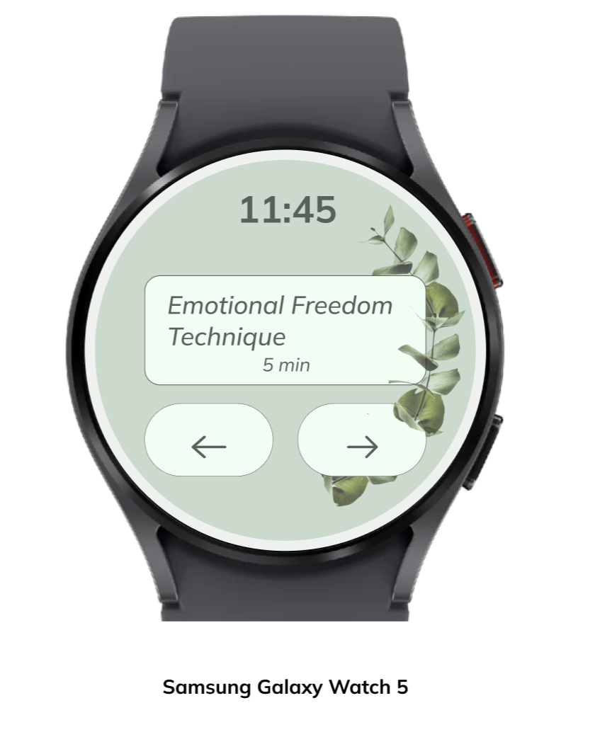
Body check-ins drawn from a recognised technique, not invented.
The emergency questions — "Is your jaw clenched?", "Is your posture straight?", "How is your breathing?" — come directly from the expert interview, where jaw tension, posture and breath were described as the body's earliest stress tells. Using an established self-awareness method meant the design reinforced something proven, rather than asking a stressed user to trust something untested.
What testing changed.
I tested the lo-fi prototype with four people, then carried the findings into the hi-fi build.
The menu was confusing — so I rebuilt it.
Testers found the original navigation inconsistent. One said the three buttons were confusing and they "wouldn't press the right one by intuition"; another said the menu page didn't match the rest of the interface. I rebuilt it into five clear, consistent options (Techniques, Settings, Analysis, To-Do, Mindfulness Check-In).
The Analysis feature came from a tester.
A tester suggested the watch should show analysis of your data over time. That connected straight back to the expert interview — tracking stress across weeks reveals whether short-term stress is becoming chronic. I added a monthly well-being overview, with a prompt to seek professional help if the trend worsens.
Fewer emergency questions.
Multiple testers said the emergency questions ran too long for a high-stress moment. I cut the set down.
What I designed for — and what I didn't claim.
The clearest lesson of this project was about scope. Amy's situation is complex and clinical, and I had a single interview and a three-month student timeline. It would have been wrong to present this as a validated solution for FND.
I designed a general daily tool for stress awareness and regulation that incorporates some of Amy's needs, rather than a medical intervention for her condition. She's an important example of who this could help — not someone the design has been validated for.
My testers were classmates and the client, not the vulnerable users the tool ultimately aims to serve. Testing the emergency flow with someone mid-episode would risk causing the exact harm the feature exists to prevent.
To take this further responsibly, I'd need clinical collaboration and a longitudinal, co-designed study with the people it's meant for — on their terms — before making any condition-specific claim.
The project delivered a validated concept and a working hi-fi prototype, presented at the client expo where several attendees said they'd want to use it. More importantly for me, it taught me to match design for a vulnerable group without overstepping what a short project can prove.
"Karīna Skarbinika contributed to the Miles smartwatch concept for people with Functional Neurological Disorder (FND) with a well-structured and user-centered design process. She translated complex stress-related challenges into a clear, intuitive interface that combines early stress detection, self-awareness, and accessible emergency support. Her work demonstrates strong analytical thinking, iterative testing, and the ability to design for vulnerable users with focus and precision."
Martin Van Der WegDirector, Miles HealthTech Foundation