
European Geological Data Infrastructure (Ongoing)
Modernizing the EGDI Map Viewer and Data Search to reduce cognitive load and improve discoverability.
Translating complex geological backend data into seamless, intuitive user experience.
The goal was to reduce user cognitive load while maintaining functionality for the Map Viewer and Search tools. The interface should be seamless experience for specialists, science enthusiasts and policy-makers.
Stakeholder and user interviews, usability testing.
User Personas, Journey Maps, and User Stories.
Low-fidelity, High-fidelity wireframes and Prototyping.
Usability testing, A/B testing, and Dev alignment.
Home Page
A harmonized entry point featuring "Quick Access" to Map Viewer and Data Search, using high-fidelity imagery.
Search Panel
Introduced advanced filtering, "Result Cards" and Preview that display metadata, sources, and validity quickly.
Map Viewer
Simplified layer management by introducing a Layer Control Panel and Layer Catalogue.
Flagship
TBD soon

Data Search

Before

After

The Solution: 3-Column Architecture
Following three rounds of iteration, a three-column interface was developed for the Data Search module to optimize information density. The layout establishes a logical progression from left to right: Filters, Search Results, and the Preview panel. A visual hierarchy was created to help users navigate complex datasets without cognitive overwhelm.
Advanced Filtering
The filtering system was improved to handle deep technical metadata while maintaining a clean user interface. Geological infrastructure remains accessible and searchable for both expert and non-expert users.
Dynamic Result Preview
The Preview area provides a comprehensive snapshot of metadata without requiring navigation away from the primary search results.
Map Viewer

Before
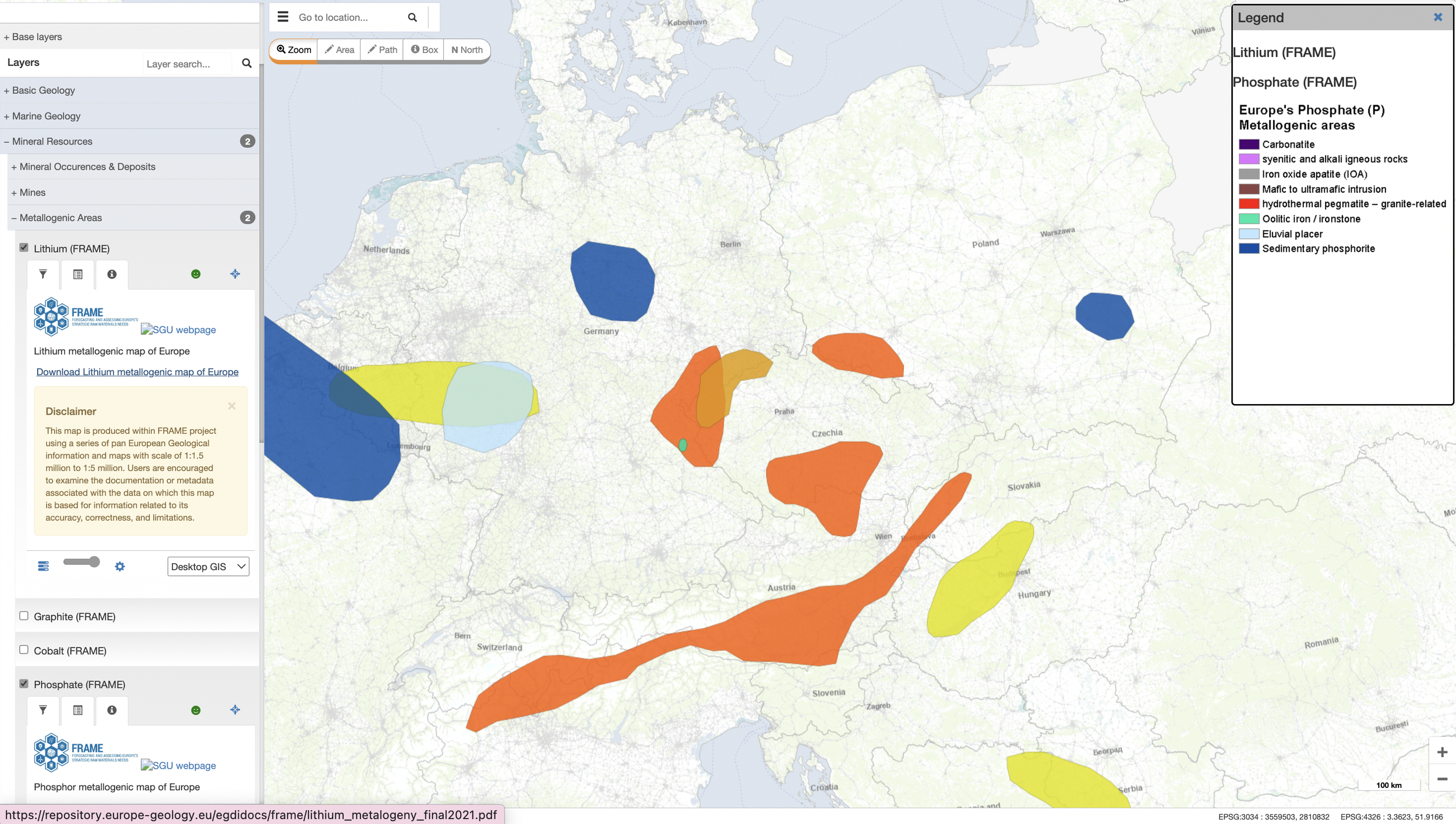

After

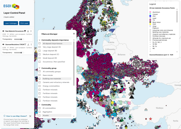
Layer Search & Discovery
The new design replaces the infinite menu with a search-and-filter system. Users can efficiently locate specific geological layers through keyword and filtering. Reduced the time spent navigating complex data hierarchies.
Layer Catalogue & Layer Control Panel
A dual-purpose Layer Control Panel was developed to simplify interactions.
The panel acts as a visual staging area, allowing users to track and manage selected layers while continuing to browse the catalogue.
Upon closing the catalogue, the panel transitions into a central command center for data manipulation.
Users can intuitively drag to reorder layers, adjust specific transparency filters, and manage complex spatial views from a single interface.
The Layer Catalogue has the same structural framework as the Data Search module to create a consistent look and feel across the entire platform.
Print Synchronization
The print engine is fully synchronized with the Layer Control Panel to maintain high-fidelity output. This ensures "What You See Is What You Get", allowing the final printed map to accurately reflect the active layers and filters configured during the analysis phase.
I really enjoyed working with Karina on the EGDI data platform. Her UX and visual design skills are excellent, but what sets her apart is her ability to truly listen and understand client needs. She consistently (and nicely) turns complex requirements into clear and effective user experiences. A young talent any team would value.